Model Walkthrough¶
A guided tour through the actual outputs of the two built components. Each section shows what's there, points at the relevant artifact, and gives a copy-pasteable snippet to load it.
This is the show me the model document. If you want the conceptual
explanation, read executive_summary.md and
model_map.md first.
1. What the model currently includes¶
Two components produce outputs:
- Historical baseline (
uv run historical) — empirical fits on Epoch's "Notable AI Models" dataset (1,011 rows, 1950–2026). - Supply capacity model (
uv run supply) — forward projection 2024–2040 across four scenarios.
Five layers are not yet built (allocation, effective compute, capability mapping, projection engine, economy feedback). They are the right side of the architecture diagram below.
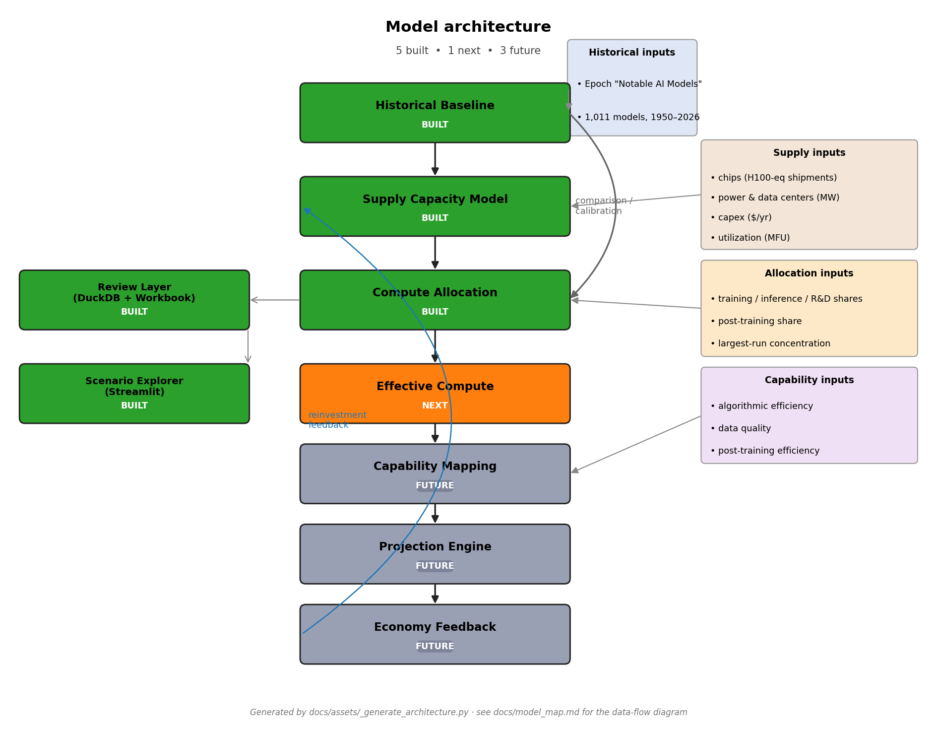
For per-component contracts see
component_contracts.md.
2. Load historical trend outputs¶
The headline historical artifact is the trend-estimates table.
import pandas as pd

trends = pd.read_csv("outputs/tables/historical_trend_estimates.csv")

# Headline: Rule A 2018+ training compute
rule_a = trends[
    (trends["trend_name"] == "training_compute")
    & (trends["frontier_rule"] == "frontier_rule_a_2018+")
].iloc[0]

print(f"{rule_a['annual_growth_multiplier']:.2f}× per year, "
      f"R²={rule_a['r_squared']:.2f}, n={rule_a['n_models']}")
# → 5.97× per year, R²=0.84, n=113
The full table has 45 rows: 5 trend types (compute / 3 cost variants /
cost-per-FLOP) × 9 frontier-rule and time-window combinations. See
output_guide.md
for column-by-column documentation.
The processed model-level data is at
data/processed/historical_models.{csv,parquet} (1,011 rows × 35 cols)
if you want to inspect or re-fit.
3. Load supply capacity outputs¶
The headline supply artifact is the year-by-year projection.
import pandas as pd

supply = pd.read_csv("outputs/tables/supply_fundamental_inputs_by_year.csv")

# Base scenario, headline summary
base = supply[supply["scenario"] == "base_input_case"].set_index("year")

print(f"2024: {base.loc[2024, 'usable_compute_flop_year']:.2e} FLOP/yr")
print(f"2030: {base.loc[2030, 'usable_compute_flop_year']:.2e} FLOP/yr "
      f"(binding: {base.loc[2030, 'binding_constraint']})")
print(f"2040: {base.loc[2040, 'usable_compute_flop_year']:.2e} FLOP/yr")
# → 2024: 3.97e+28 FLOP/yr
# → 2030: 1.35e+30 FLOP/yr (binding: capex)
# → 2040: 1.65e+31 FLOP/yr
The four scenarios live in scenarios/supply_*.yaml. Their numerical
inputs come from data/assumptions/supply_input_assumptions.yaml; per-
input provenance is in input_provenance.md.
4. Historical frontier training compute¶
The Rule A 2018+ trend visualised against all historical models in the dataset:
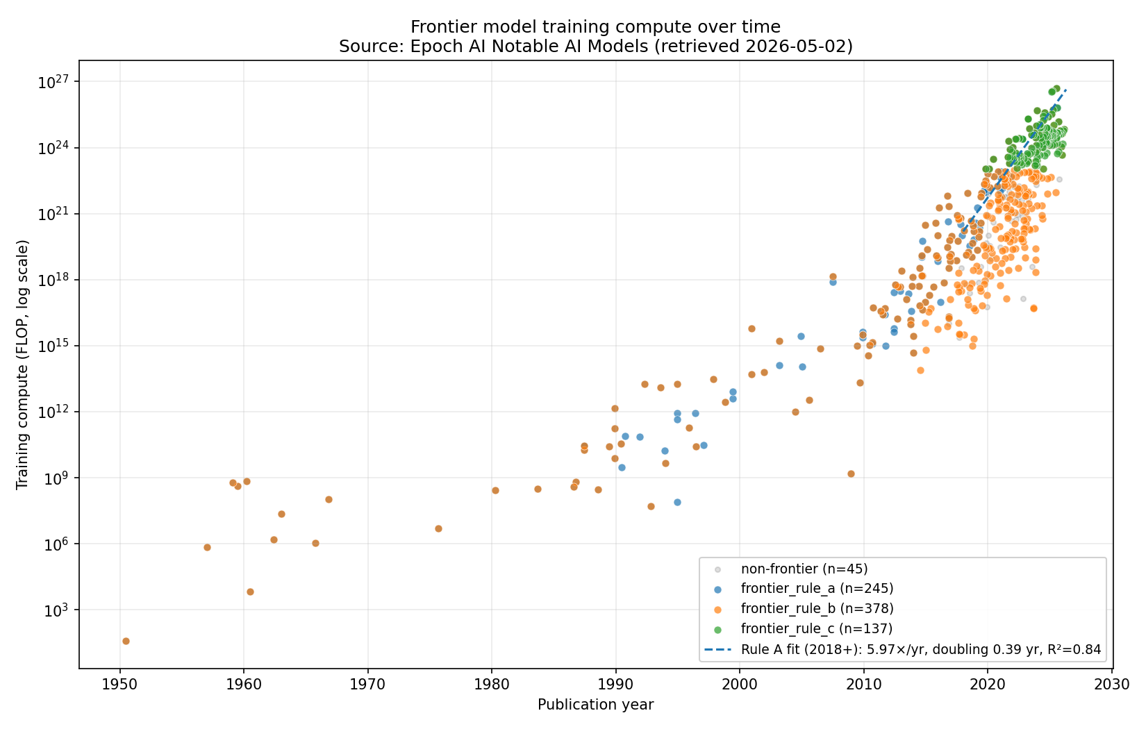
Reading notes:
- Each dot is one model from Epoch's dataset, plotted at its publication date and training-compute FLOP.
- The dashed line is the Rule A 2018+ fit (5.97×/yr).
- "Frontier" here means Rule A — top-10 by compute within a 1-year
rolling window at each model's release. Rules B and C give different
slopes; see
historical_trend_estimates.csvandhistorical_findings.md§4–5 for the rule- sensitivity comparison.
Other historical charts: by-organization breakdown, residuals, hardware
timeline, three cost variants. All under outputs/charts/historical_*.png.
5. Supply usable compute scenarios¶
The four scenarios visualised together:
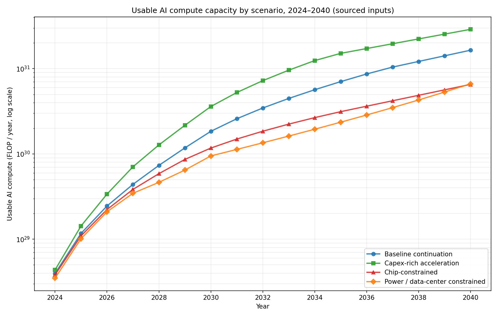
Reading notes:
- Each line is one scenario's
usable_compute_flop_yearfrom 2024–2040. - Y-axis is log-scale. The vertical spread between scenarios is roughly one order of magnitude by 2040.
- The base scenario (blue) is the recommended central case, anchored to Epoch's August 2024 scaling estimates and IEA's April 2025 Energy and AI report.
Companion chart showing which constraint binds in each year:
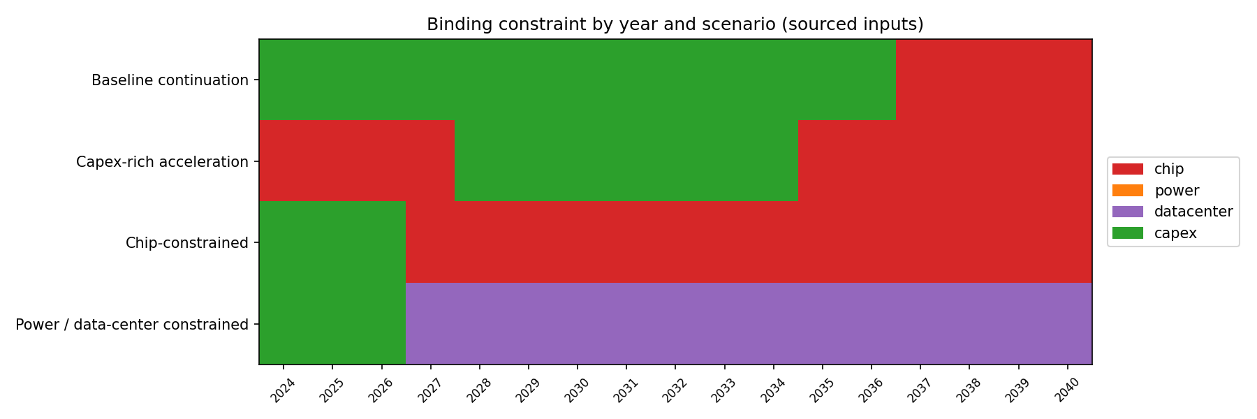
In the base and capex-rich scenarios, capex binds early then chip takes over; in the chip-bottleneck scenario, chip binds throughout; in the power/DC-bottleneck scenario, datacenter binds 2026–2040.
6. Why these are different quantities¶
The most common reading mistake is comparing the historical 5.97×/yr trend to the supply 45.7%/yr CAGR as if they were forecasts of the same thing.
| Historical (Rule A 2018+) | Supply (base scenario) | |
|---|---|---|
| Quantity | FLOP per single training run | FLOP per year, total global usable AI compute |
| Time horizon | 1950–2026 (descriptive fit) | 2024–2040 (projection) |
| Headline | 5.97× per year | 45.7% per year (CAGR) |
| Source | Epoch's "Notable AI Models" dataset | Sourced + synthesized inputs |
| Role | Calibration / comparison target | Forward causal model |
The combined chart, with the historical fit overlaid on the four supply scenarios:
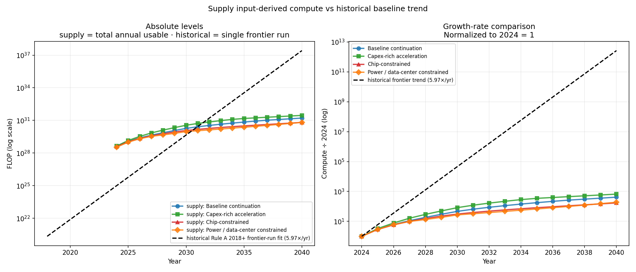
The historical extrapolation (dashed black) is roughly 10 OOM above even the most aggressive supply scenario by 2040. That gap is real and informative — but it is not the historical trend "winning" against the supply forecast. It's two different things being compared on one axis.
The historical trend is a single training run's compute. The supply trend is all global AI compute. A frontier run consumes some share of total compute, and that share has been growing (small in 2018, larger in 2024).
7. The missing allocation bridge¶
To compare the two trends apples-to-apples, we need to know the share of total annual usable compute that goes to the single largest training run. That's what the allocation layer will do:
largest_frontier_run_flop_t
    = usable_compute_flop_year_t           ← from supply model
      × training_share_t                    ← from allocation
      × largest_run_concentration_t         ← from allocation
With this in hand, the supply-capacity scenarios can be projected forward as single frontier-run trajectories, directly comparable with the historical Rule A 2018+ trend.
A backcast applied to 2018–2024 should approximately reproduce the historical 5.97×/yr trend; if it doesn't, the allocation parameters are mis-specified or the supply model is mis-anchored. That's the calibration test the allocation layer's design must pass.
8. Preview of the planned allocation output shape¶
The proposed output table from the allocation layer:
outputs/tables/largest_frontier_run_flop_by_year.csv

scenario              year   training_share   largest_run_concentration   largest_frontier_run_flop
base_input_case       2024   0.35             0.10                        1.39e+27
base_input_case       2025   0.36             0.11                        ...
...
chip_bottleneck       2030   0.30             0.15                        ...
...
Plus a chart overlaying the implied single-frontier-run FLOP from each supply scenario against the historical Rule A 2018+ trend on the same axes. This is the chart that finally makes the two layers comparable.
For the full spec see
component_contracts.md.
What to read next¶
executive_summary.md— the one-pager.model_map.md— the architecture and data-flow diagrams.historical_findings.md— full historical-baseline memo with rule sensitivity, cost-variant analysis, and supply-capacity handoff parameters.supply_findings.md— full supply-capacity memo with sourced inputs, sensitivity bands, and allocation-layer handoff parameters.scope.md— merged scope for both components.